Color Correction in Lightroom: Achieving Accurate Colors
Color correction is crucial for photographers aiming to achieve realistic and visually appealing images. Lightroom offers a powerful suite of tools to adjust colors, fix white balance issues, and create stunning effects. This guide dives deep into Lightroom's color correction capabilities, exploring techniques for achieving accurate colors and enhancing your photographs. We'll also look at specific product recommendations and their uses to help you make informed decisions.
So, you've got your photos imported into Lightroom, and they're... okay. But they're not *amazing*. Maybe the colors are a bit off, the white balance is wonky, or the overall feel just isn't quite right. That's where color correction in Lightroom comes in! This isn't just about making things "pretty"; it's about accurately representing the scene you captured and bringing your creative vision to life. Let's dive into the world of Lightroom's color tools and learn how to make your photos pop.
Understanding White Balance in Lightroom for Accurate Color Rendition
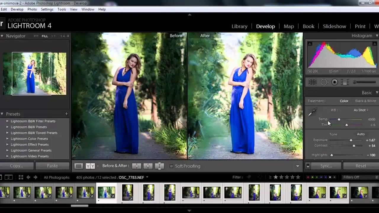
White balance is the foundation of accurate color. Think of it as telling your camera what "white" looks like. If your white balance is off, your colors will be off too. Lightroom offers several ways to adjust white balance:
- Presets: Lightroom comes with presets like "Auto," "Daylight," "Cloudy," "Shade," "Tungsten," and "Fluorescent." These are a good starting point, especially if you shot in RAW.
- Eyedropper Tool: This is your secret weapon! Click on a neutral gray area in your image, and Lightroom will adjust the white balance accordingly. Look for things like concrete, white walls, or even a gray card if you used one.
- Temperature and Tint Sliders: These give you fine-grained control. Temperature adjusts the warmth or coolness of the image (blue to yellow), while Tint adjusts the green or magenta.
Pro Tip: Shoot in RAW! RAW files contain much more color information than JPEGs, giving you more flexibility in post-processing.
The Power of the Basic Panel Color Controls in Lightroom
The Basic panel is your central hub for making global adjustments to your image. Here's how the color-related sliders can help:
- Exposure: Adjusts the overall brightness of the image. Be careful not to overexpose (blow out highlights) or underexpose (lose detail in the shadows).
- Contrast: Increases or decreases the difference between the highlights and shadows. A little contrast can add punch, but too much can look harsh.
- Highlights: Adjusts the brightness of the brightest parts of the image. Use this to recover detail in blown-out skies or reduce harsh highlights.
- Shadows: Adjusts the brightness of the darkest parts of the image. Use this to bring out detail in dark areas.
- Whites: Sets the white point of the image. Adjust until the brightest areas are just below clipping (becoming pure white).
- Blacks: Sets the black point of the image. Adjust until the darkest areas are just above clipping (becoming pure black).
- Clarity: Adds mid-tone contrast, making the image look sharper and more defined. Use sparingly, as too much can look artificial.
- Vibrance: Increases the saturation of the less saturated colors in the image. This is a great way to boost colors without making skin tones look unnatural.
- Saturation: Increases the saturation of all colors in the image. Use with caution, as it can easily make your image look oversaturated.
HSL/Color Panel: Targeted Color Adjustments for Lightroom Users
The HSL/Color panel is where you can really fine-tune your colors. HSL stands for Hue, Saturation, and Luminance. This panel allows you to adjust these three properties for each of the eight color ranges: Red, Orange, Yellow, Green, Aqua, Blue, Purple, and Magenta.
- Hue: Changes the color itself. For example, you could shift a blue sky towards cyan or a red flower towards orange.
- Saturation: Increases or decreases the intensity of the color.
- Luminance: Adjusts the brightness of the color.
Example: Let's say the sky in your photo is a bit too dull. You could go to the "Blue" section of the HSL/Color panel and increase the saturation to make the blue more vibrant. Or, if the skin tones are a little too orange, you could go to the "Orange" section and slightly shift the hue towards red.
Color Grading in Lightroom: Creative Color Styles and Techniques
Color grading is a more advanced technique that involves adding specific color tints to the shadows, midtones, and highlights of your image. This can be used to create a wide range of moods and styles.
Lightroom's Color Grading panel (formerly Split Toning) allows you to:
- Adjust the hue and saturation of the shadows, midtones, and highlights independently.
- Balance the colors between the shadows and highlights.
- Control the blending of the colors.
Popular Color Grading Styles:
- Teal and Orange: Adds a teal tint to the shadows and an orange tint to the highlights. This is a popular look for cinematic photography.
- Vintage: Creates a warm, faded look by adding a yellow tint to the highlights and a brown tint to the shadows.
- Monochrome: Creates a black and white image with subtle color tints.
Specific Product Recommendations for Color Management in Photography
While Lightroom is powerful, accurate color management requires more than just software. Here are a few products that can help:
ColorChecker Passport Photo 2 by X-Rite
Description: The ColorChecker Passport Photo 2 is a small, portable color calibration target that allows you to create custom camera profiles for Lightroom and other editing software.
Use Case: Before a shoot, photograph the ColorChecker Passport Photo 2 under the same lighting conditions as your subject. Then, import the photo into Lightroom and use the ColorChecker Passport plugin to create a custom camera profile. This profile will ensure that your colors are accurate and consistent across all your images.
Comparison: While there are other color calibration targets available, the ColorChecker Passport Photo 2 is widely considered to be the best in terms of accuracy and ease of use. It's more expensive than some other options, but the results are worth it.
Price: Around $200 USD.
BenQ SW270C 27 inch Monitor
Description: The BenQ SW270C is a professional-grade monitor designed for photographers and graphic designers. It features a wide color gamut (99% Adobe RGB coverage), accurate color calibration, and hardware calibration support.
Use Case: If you're serious about color accuracy, you need a monitor that can accurately display the colors in your images. The BenQ SW270C is a great choice because it's factory-calibrated and supports hardware calibration, which means you can calibrate the monitor directly using a calibration device (like the X-Rite i1Display Pro). This ensures that your colors are accurate and consistent over time.
Comparison: There are other professional-grade monitors available, such as those from Eizo and Dell. However, the BenQ SW270C offers a great balance of performance and price.
Price: Around $800 USD.
X-Rite i1Display Pro
Description: The X-Rite i1Display Pro is a monitor calibration device that allows you to calibrate your monitor to ensure accurate color reproduction.
Use Case: Over time, your monitor's color accuracy can drift. The i1Display Pro helps you maintain accurate colors by measuring the colors your monitor is displaying and creating a custom profile that corrects any inaccuracies. Use it regularly (e.g., once a month) for optimal results.
Comparison: The SpyderX Pro is another popular monitor calibration device. While both are good options, the i1Display Pro is generally considered to be more accurate and offers more advanced features.
Price: Around $250 USD.
Practical Lightroom Editing Scenarios for Color Perfection
Let's look at some common scenarios and how to tackle them using Lightroom's color tools:
- Underexposed Photos: Start by increasing the Exposure slider. Then, use the Shadows and Whites sliders to bring out detail in the dark areas and recover highlights. Adjust the Contrast and Clarity sliders to add punch.
- Overexposed Photos: Start by decreasing the Exposure slider. Then, use the Highlights and Blacks sliders to recover detail in the blown-out areas and darken the shadows.
- Photos with a Color Cast: Use the White Balance tool to correct the color cast. The Eyedropper tool is often the easiest way to do this.
- Photos with Dull Colors: Use the Vibrance and Saturation sliders to boost the colors. Be careful not to overdo it.
- Photos with Unnatural Skin Tones: Use the HSL/Color panel to adjust the hue, saturation, and luminance of the orange and red color ranges.
Remember, practice makes perfect! The more you experiment with Lightroom's color tools, the better you'll become at achieving accurate and visually appealing colors.
:max_bytes(150000):strip_icc()/277019-baked-pork-chops-with-cream-of-mushroom-soup-DDMFS-beauty-4x3-BG-7505-5762b731cf30447d9cbbbbbf387beafa.jpg)